VELA Web App Design
Project Overview
Description: VELA is a web app geared toward water sports enthusiasts, helping them determine if the weather and water conditions are safe and fun for their sport.
Challenge: The multitude of existing weather apps are not specifically designed with their particular needs in mind and oftentimes people resort to checking multiple apps and asking questions about location conditions in forums until they find all the needed information.
Duration: 6 months (November 2020 — May 2021)
My Role: UX Research, Personas, Journey Mapping, Task Analysis, Information Architecture, Wireframing, High-Fidelity Prototyping, Usability Testing, UI Design (Solo Project)
Tools: OptimalSort, Marvel, Adobe XD, Photoshop, UsabilityHub
How might we help water sports participants make informed weather and water safety decisions?
The solution hypothesis that best meets users’ needs is to provide a highly customizable web app that:
• Sends warnings about dangerous weather;
• Lets users set up push notification reports for specific dates/times;
• Displays preferred weather (temperature, winds, storms) and water (temperature, tides, waves, surge, currents, debris, algae) modules;
• Provides weather reports for multiple locations;
• Can save preferences for multiple water sports;
• Provides a guide to interpreting marine weather specific to each location and water sport and lets users add to the information.
The same user might want some weather data if they are diving and might need slightly different if they will be surfing. Users can save the settings under a separate sport profile along with their preferred locations for that sport. The app can include a map that shows nearby locations along with brief weather conditions.
Emerging opportunities
SWOT and UX Analysis revealed the following product market fit opportunities:
• No existing weather service site/app catering to underwater sports;
• Present detailed data in an easy-to-navigate, meaningful way;
• Reliable service and accurate data across different platforms is needed;
• Visually driven interface with the ability to select spots on a map without typing.
What are Our Business Objectives?
I identified the following opportunities for differentiation and outlined key objectives:
• Differentiate by providing service to an unrepresented segment of water sports, such as underwater activities;
• Potential market: around 3.5 million scuba divers & 11 million snorkelers in the US, 6 million divers & 20 million snorkelers worldwide;
• Gain market share by providing excellent data presentation and accuracy;
• Provide added value by including hard-to-find related information.
user research goals
• Discover the most significant competitors;
• Find out people’s needs and challenges when using weather apps;
• Find out which weather conditions are most important to water sport enthusiasts;
• Discover users’ pain points in reading and interpreting the weather & water safety.
User Research Insights
To test the initial hypothesis, I interviewed 5 divers with different experience levels, conducted an online survey, and had conversations on a diving forum.
-
• Convey information at-a-glance;
• Weather precision and reliability;
• Rating of the conditions for diving. -
• Most important weather parameters for divers - thunderstorms, water temperature, winds, and waves;• Local flora & fauna can pose dangers for divers;
• Divers need to feel secure in the weather conditions (& choice of proper wetsuit) to enjoy. -
• Weather apps do not provide underwater conditions;
• Local divers, diving stations, and shops hold valuable info about local currents, terrain, thermal layers, etc. -
• Researching, planning, and booking a diving trip is done a few months ahead;
• Historic weather key for researching;
• Local & faraway locations (planned trip);
• Local diving trips can be booked with less planning, but still, a lot of research is involved.
Who are we designing for?
Observation
People’s understanding of the weather correlated with their diving experience level;
Each segment wanted slightly different things from a weather app.
solution
3 distinct Personas
Let me introduce you to Jacques, the expert diver, Michael, the intermediate diver, and Elisa, the beginner.
What would they need from the web app?
I created User Journeys based on the stories from the interviews, which enabled me to:
• Keep the user’s perspective in mind;
• Zoom in on their problems and start designing solutions by examining how each would go through a likely scenario;
• Track their thoughts and emotions as they went through completing the tasks;
• Identify opportunities for the web app, such as providing safety tips and travel guides.
How can they achieve it?
In addition to the User Journeys, I used User Flows to bring me closer to understanding the problem and start mapping out the site. At this point, I had to make a decision on where to place key features such as selecting custom weather parameters, which were essential for expert divers but not (yet) needed for inexperienced ones like Elisa. I will find out if that was the right placement after conducting Usability Testing of the prototypes.
finally, Time for sketching!
A bit of pivot here: from the user research I learned that some people want to engage in a variety of water sports (expert divers, and beginner surfers). I decided not to limit the target audience to divers and snorkelers and thus needed the VELA web app to display weather data relevant to different water sports. Sketching took a few iterations, but that’s where my thoughts started to get organized and lean towards enabling multiple sports profiles.
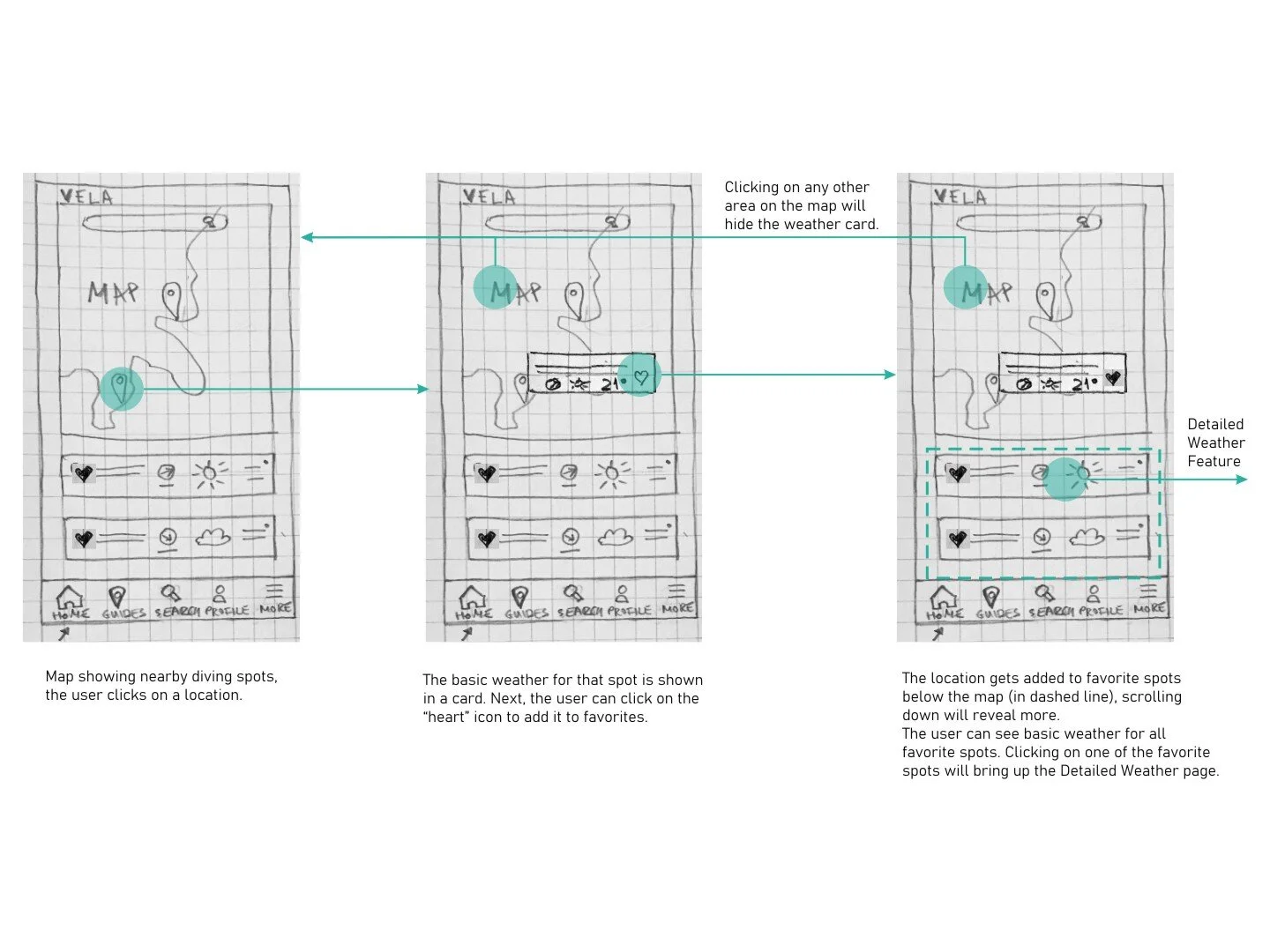
Since most users need to search for a location where they can engage in water sports, it was most intuitive to include both a search bar and a map on the home screen to get users faster to the desired weather. I decided to include a weather overview for all favorite locations on the same screen for faster access and at-a-glance comparison.


Is it Useful? And Is it Delightful?
Conducted 6 remote Usability Tests to uncover weak points in the use flows and design.
Issue 1 (High Severity)
The algae, weather settings, route, and alerts icons were unclear to participants.
Suggested Change
Revise icons & add labels.
Issue 2 (High Severity)
Ambiguous rating and how many stars are the maximum.
Suggested Change
Show 5 stars and a description of the conditions rating.
Issue 3 (Medium Severity)
No way to change the degree units from C to F.
Suggested Change
Add units to weather settings to make adjustments easier.
Issue 4 (Medium Severity)
Want to see detailed weather before adding a spot to favorites. Not very clear that a spot was added to favorites. The spot card disappeared after clicking on the heart.
Suggested Change
Make spot cards larger and allow viewing detailed weather without adding to favorites. Add a confirmation message after the user adds a spot to favorites while leaving the card visible. Include “Add to favorites” from the detailed weather page.
Issue 5 (Medium Severity)
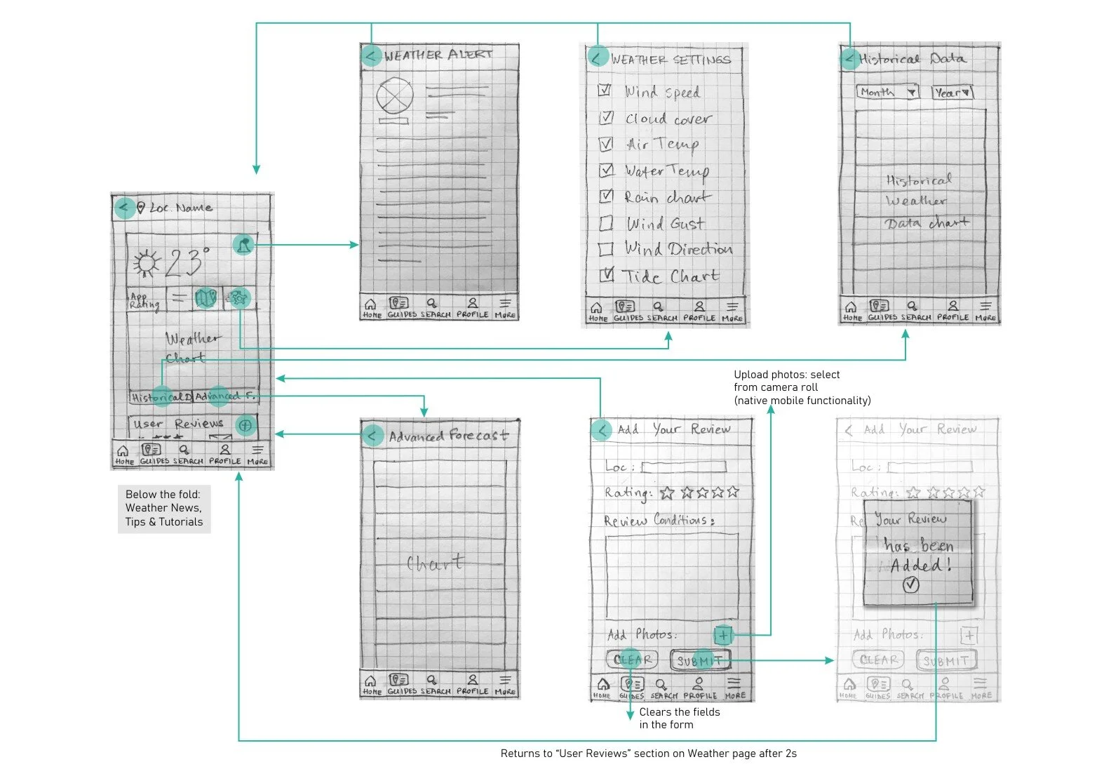
The placement of the icons in the top card did not match the participant’s mental model, they went to “More” on the tab menu to change settings and route to the location or to “Guides” to route to the location.
Suggested Change
Separate settings/utilities from the top card on the Detailed Weather page and retest. Possibly hide Route to Spot to de-clutter the page.
Let’s push it even more - preference testing
After revising the prototype, I conducted a few quick preference tests to uncover:
How people felt about the overall look;
How to improve it further by adding delight to the usefulness.
insights
People liked the image, colors, and the better contrast between the background and the logo/text color. Frequently used words: cleaner, modern feel.
Action
Use the new intro screen and introduce a greener shade of blue into the color palette.
insights
People liked the less crowded layout, less text, and the radial design caught their eye and felt more dynamic.
Action
Redesign the 3 onboarding screens to follow the new pattern and reduce the verbiage.
insights
People felt the layout was too crowded, wanted to simplify it even more, but at the same time, they liked having the tides at a glance. Then the other half of the participants wanted to see all info without clicking.
Action
Redesign the weather screens to include one with less info and test again.
insights
Including scuba divers from the forum tipped the preference for the most information-heavy layout to 45%. They liked the orange bar with dates, visible settings, and extended forecast. 33% liked the simpleest option (more spacious and less overwhelming).
Action
Show different weather parameters based on the user’s sports proficiency; re-test.
refining the design
With the findings from the Usability and Preference Testing, and using Gestalt psychology and visual design principles, I set out to refine and polish the prototype. I changed the look of the introduction & onboarding screens and the detailed weather using grids, being mindful of spacing, accessibility issues, and editing for consistency.
Home/Map Screen
Detailed Weather Screen
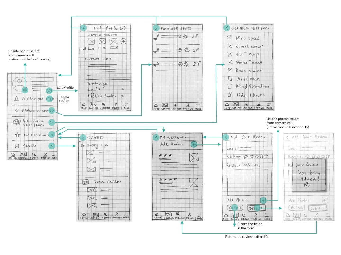
Profile Screen
Reviews Screen
Final Prototype
I received some peer feedback, which sparked ideas for new micro-interactions, such as adding the alert to the favorite spot card (if any) and how to remove a favorite spot. Try the Final Prototype and let me know what you think!
Next Steps
Learn Axure to use conditional logic and show weather screens tailored to users’ sports level (fewer parameters for “Elise”, the beginner, and more for “Jacques”, the expert);
Two rounds of user testing (beginners & experts) focused on the Detailed Weather page to find out how much the last iteration improved usability;
Design the remaining functionality - Travel Guides, search suggestions, etc;
Design the desktop high-fidelity prototype.
Credits: Icons - flaticon.com, fonts.google.com/icons, thenounproject.com; Photos - unsplash.com.


