Website redesign increased completed orders by 24%
Responsive
Accessibility
Small Business
Coding


Overview
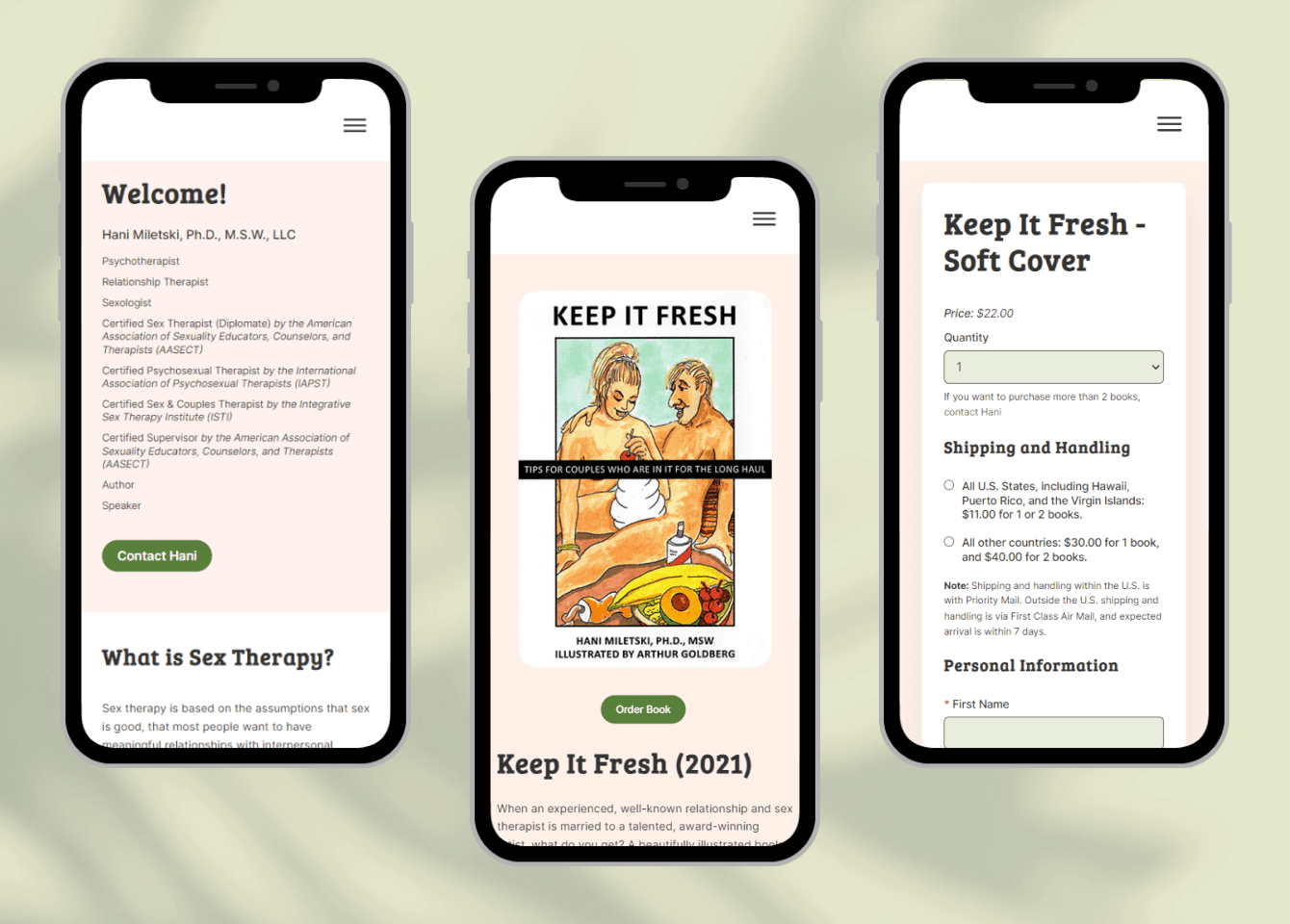
Hani is a certified therapist who wanted her website to reflect her brand and be more inviting to the wide variety of individuals she serves. Shea also wanted a better checkout for people purchasing her books, regardless of what device or screen size they used.
Status: Released December 2023
The Challenge
The previous site was quite outdated, not optimized for mobile devices, and buying her books was cumbersome. Hani did not want to use a standard e-commerce site because she already had a functioning database and checkout.
My challenge was to work with the existing PHP and JQuery code, adding functionality such as order summary and automatically collecting state sales tax.
Existing Website Audit
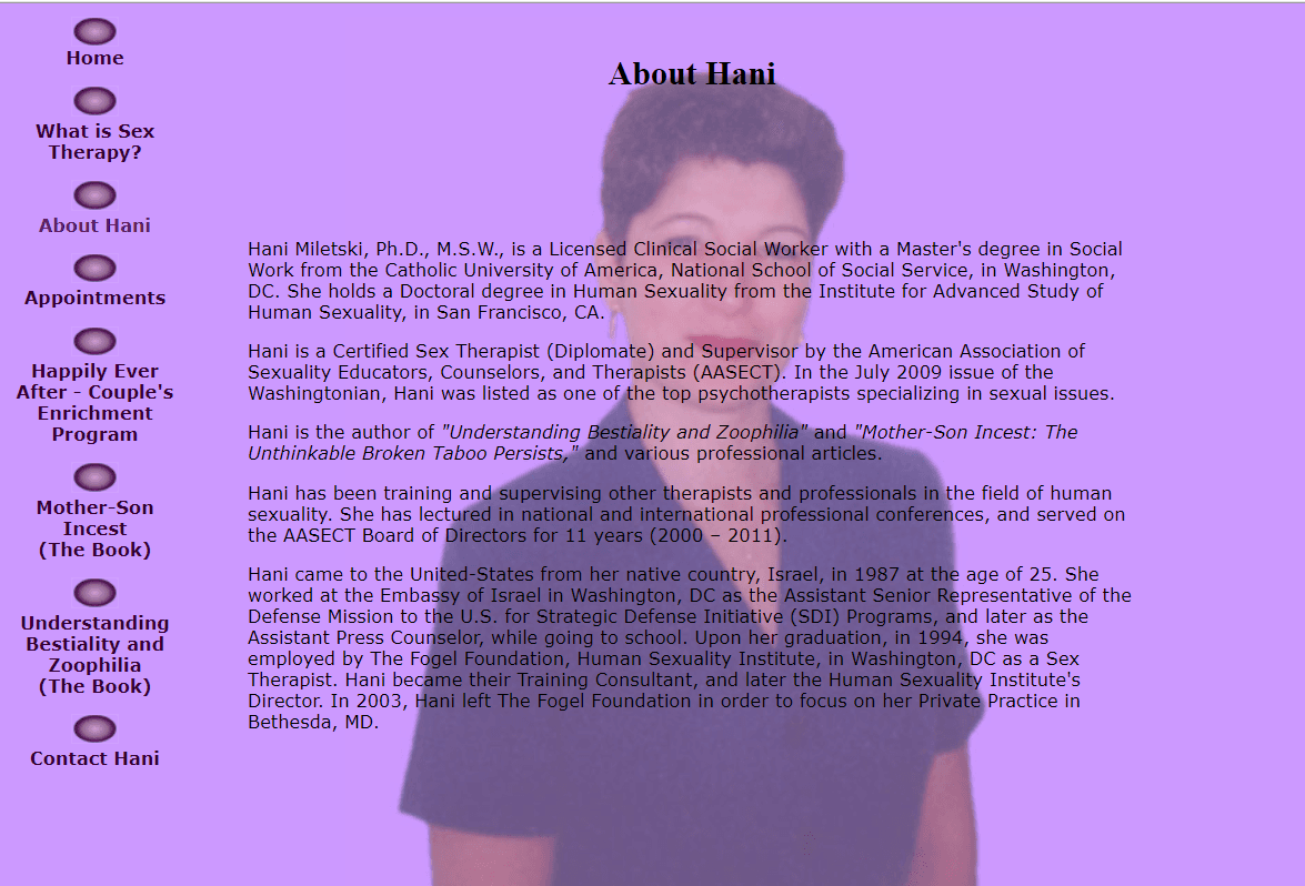
About Hani
Long lines of text, overlayed over Hani’s image made it hard to read the content.
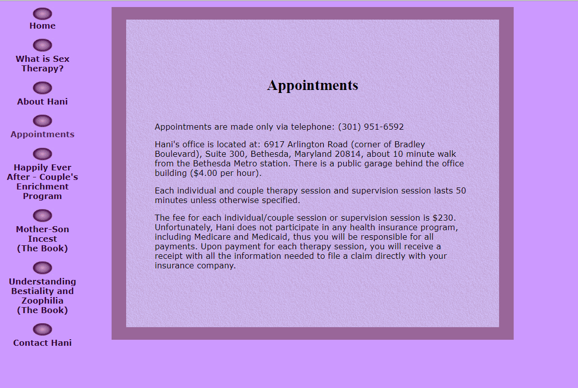
Appointments
The old-style table with cells colored to make a frame was not responsive and was too small for modern-day screens.
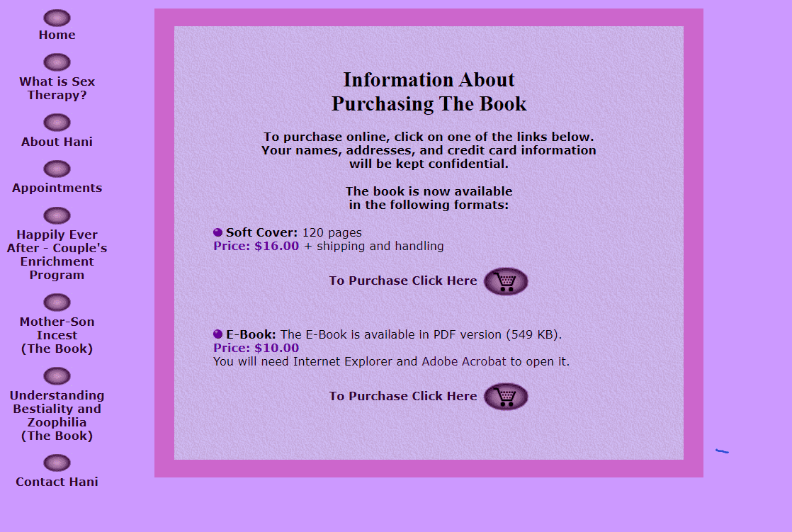
Information Page
This was an extra page in the purchasing flow, and its content was moved in the new site.

Book Page
The icons were overpowering the information and visitors did not have a clear, quick way to purchase the book.
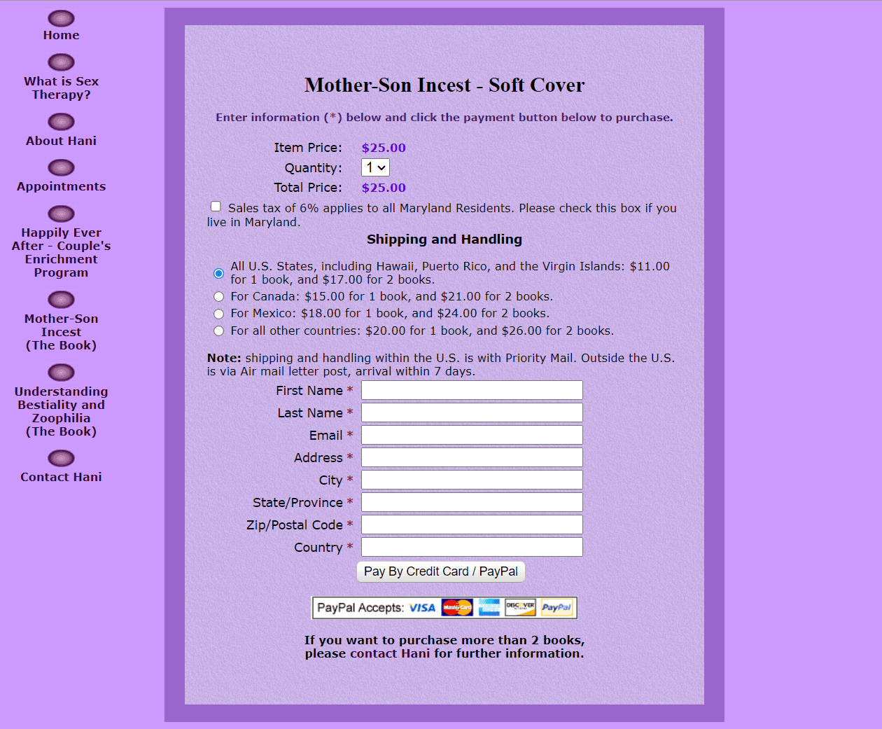
Purchase Form
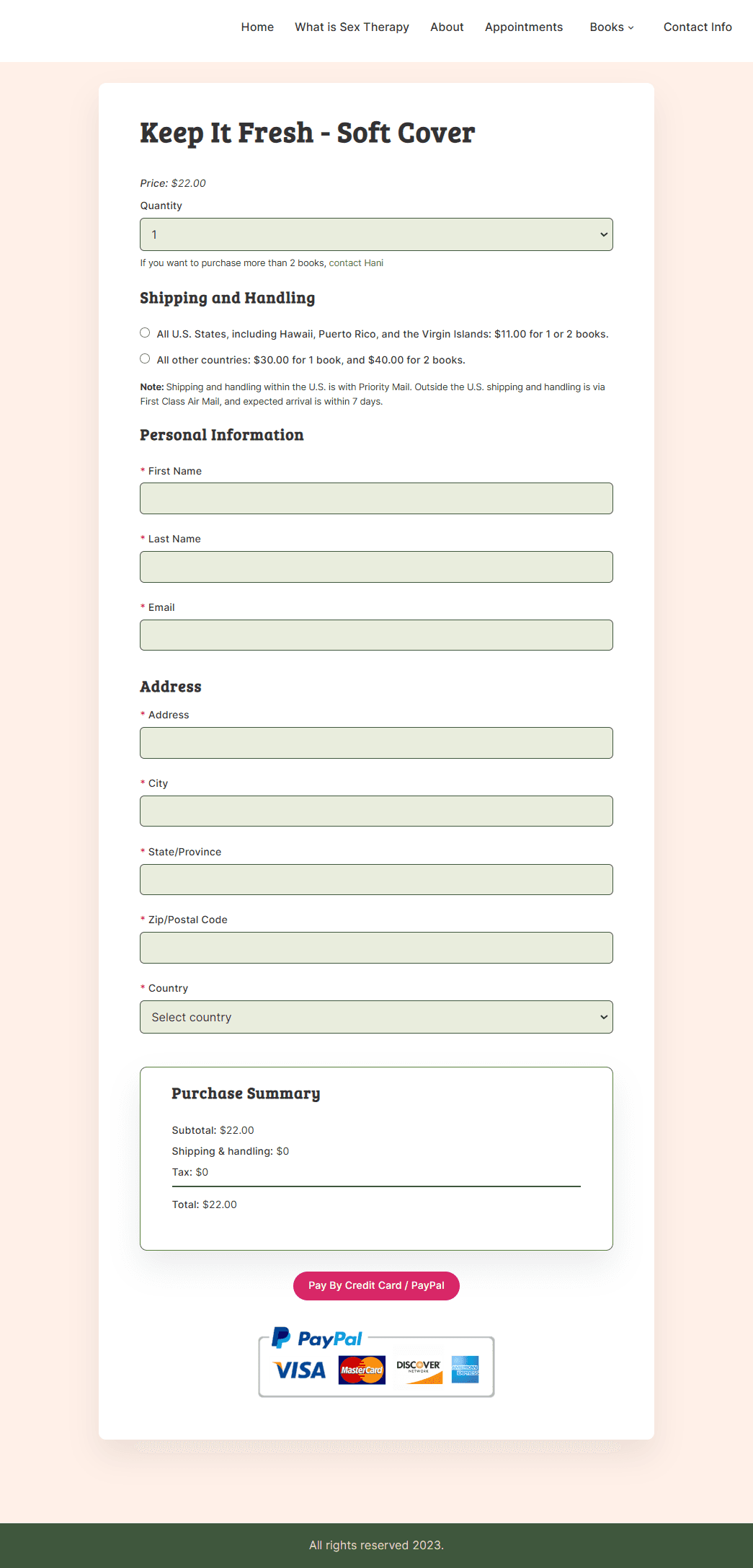
A mix of center and left justified layout, together with small fields and a button that were too close together contributed to a cluttered page and increased cognitive load.
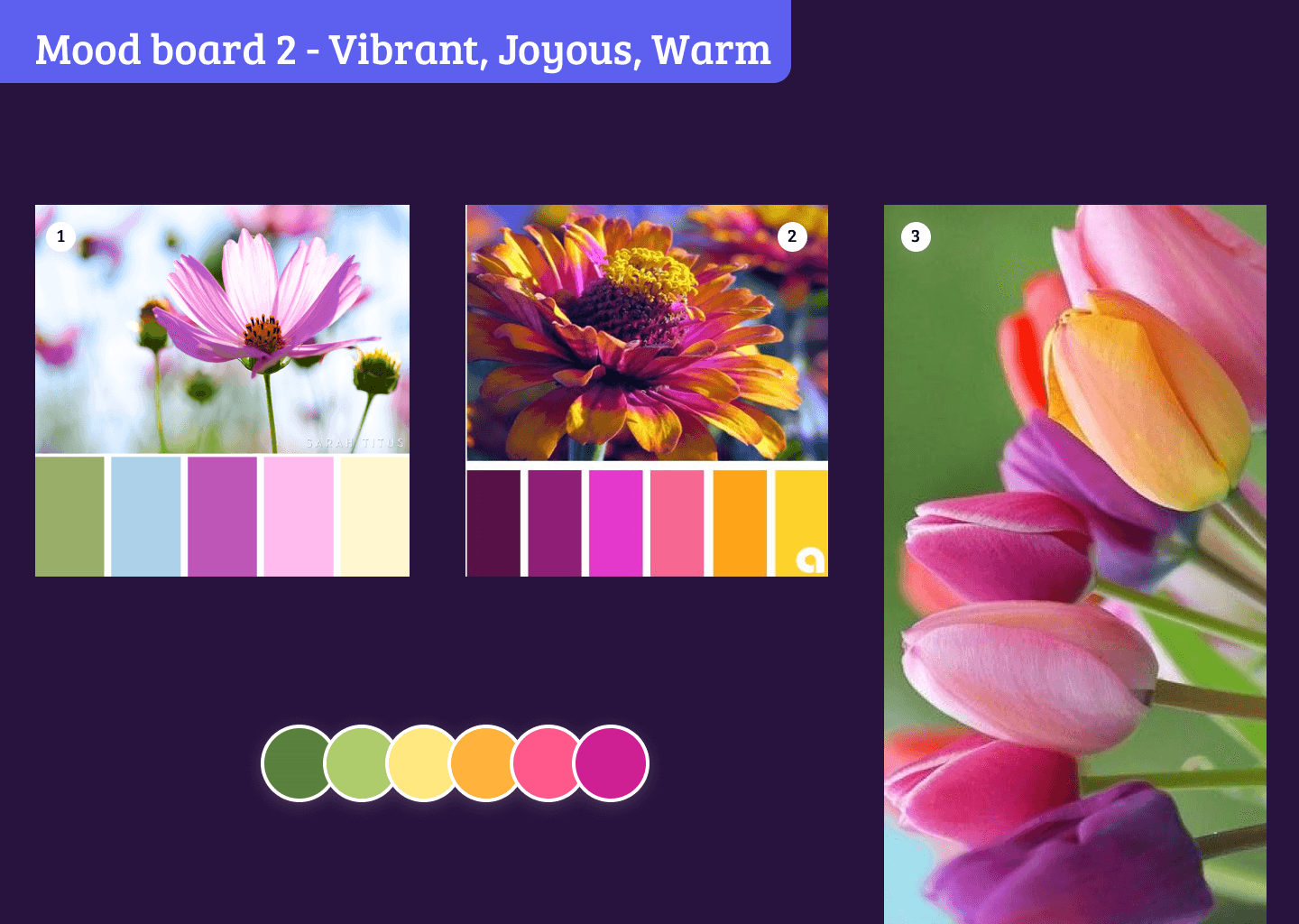
Mood Board
Hani wanted the new site to be cheerful, optimistic, and warm. We worked out a color palette built around the mood board that passes accessibiity contrast ratios.
I selected images evoking warmth, love, and happiness, while representing the variety of clients she supports.
Building the static pages was easy and a lot of fun.
Simplifying Book Ordering
Each book page now contains all its supporting information - info about the book, testimonials, and feated on, so the visitor can find everything in one place without going back and forth to multiple pages.
Optimizing the Check Out Form
I optimized the checkout form by making the input fields larger and responsive, and adding an order summary, which includes shipping charges and any applicable tax. The biggest challenge for me was repurposing the existing code and adding validations for the tax and order summary.
Ensuring the pages look great and are usable on mobile devices was another goal of the website redesign, so that users can purchase books from anywhere.
Accessibility Unlocked
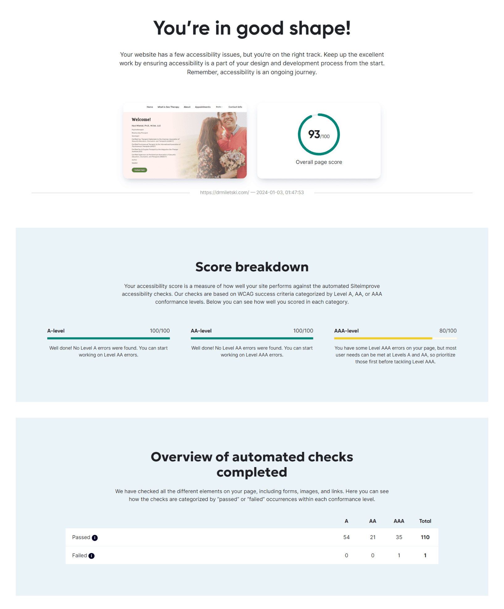
Making the website accessible means that more people can interact with and navigate the information, and at the same time improves usability for everyone.
Contrast Ratio
All text has 4.5:1 contrast ratio with the background. All graphical elements have 3: contrast with the surrounding background.
Keyboard Navigation
The website is fully accessible by keyboard and includes a hidden “skip navigation” link.
Reflow
No loss of content or functionality occurs, and horizontal scrolling is avoided when content is presented at a width of 320 pixels.
Semantics
Semantic elements are used throughout the site, as well as correct header order.
Final Designs
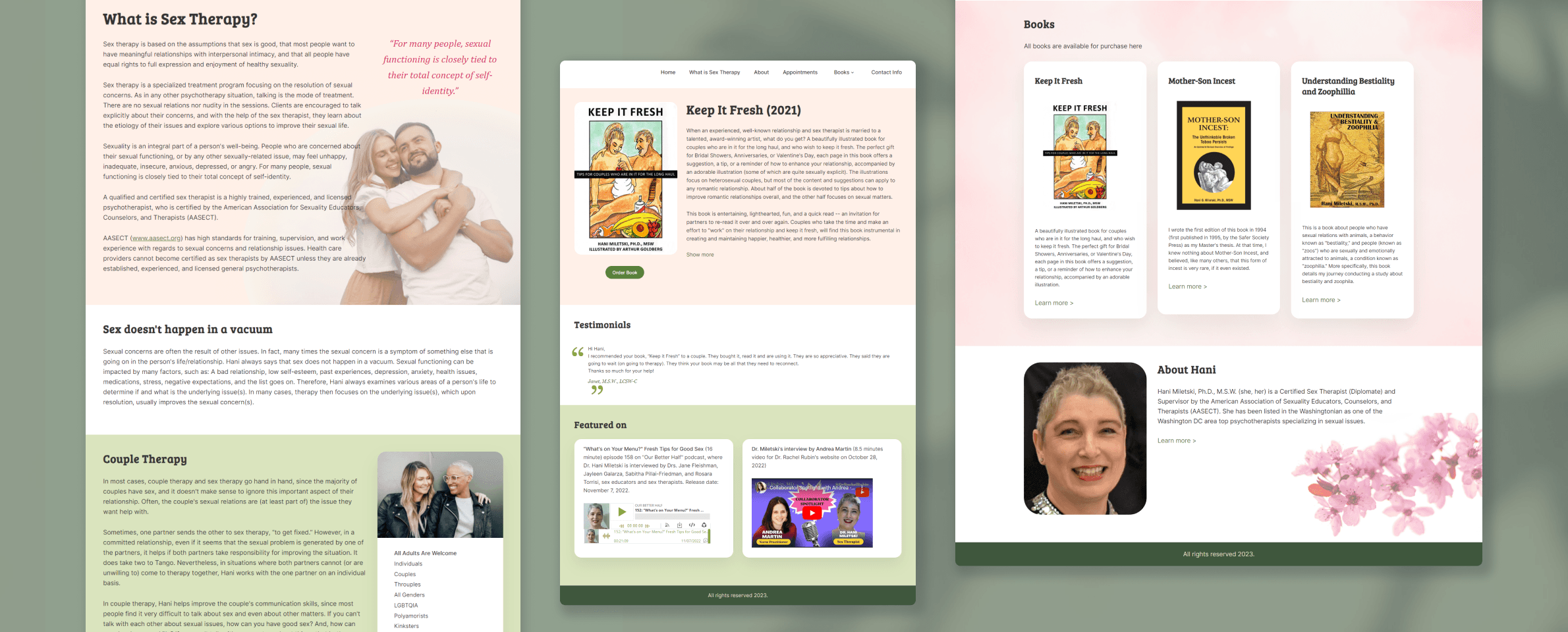
The finished responsive website serves 2 types of audiences: individuals or groups seeking therapy, and researchers and therapists wanting to purchase Hani’s books. The overall look and feel is warm and inviting, while at the same time trustworthy and clean.
Users can learn about the books without navigating back and forth to multiple pages, and order faster, on any device.
Usability Improvements
Users can learn about the books without navigating back and forth to multiple pages;
Streamlined ordering with automatic MD sales tax applied;
Preview of total order amount before passing to PayPal for payment;
Content is accessible and easy to read on large and small devices.
Outcomes
Completed orders in 2024 increased by 24% from 2023;
No service calls for uncollected Maryland tax;
93% accessibility score, with 0 AA level errors and only 1 AAA level error, ensuring a larger group of users can book appointments or purchase books.
