VELA Web App Design
Web App
Responsive
Design System
Project Overview
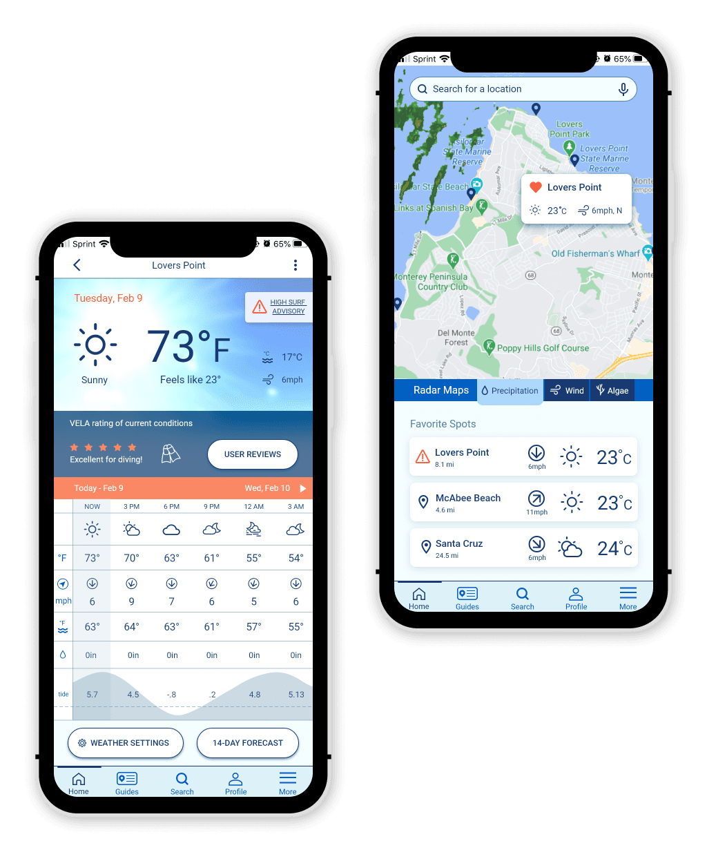
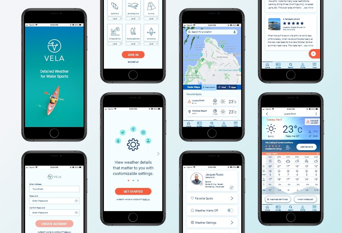
Description: VELA is a web app geared toward water sports enthusiasts, helping them determine if the weather and water conditions are safe and fun for their sport.
Challenge: The multitude of existing weather apps are not specifically designed with their particular needs in mind and oftentimes people resort to checking multiple apps and asking questions about location conditions in forums until they find all the needed information.
Duration: 6 months (November 2020 — May 2021)
My Role: UX Research, Personas, Journey Mapping, Task Analysis, Information Architecture, Wireframing, High-Fidelity Prototyping, Usability Testing, UI Design (Solo Project)
Tools: OptimalSort, Marvel, Adobe XD, Photoshop, UsabilityHub
How might we help water sports participants make informed weather and water safety decisions?
The solution hypothesis that best meets users’ needs is to provide a highly customizable web app that:
• Sends warnings about dangerous weather;
• Lets users set up push notification reports for specific dates/times;
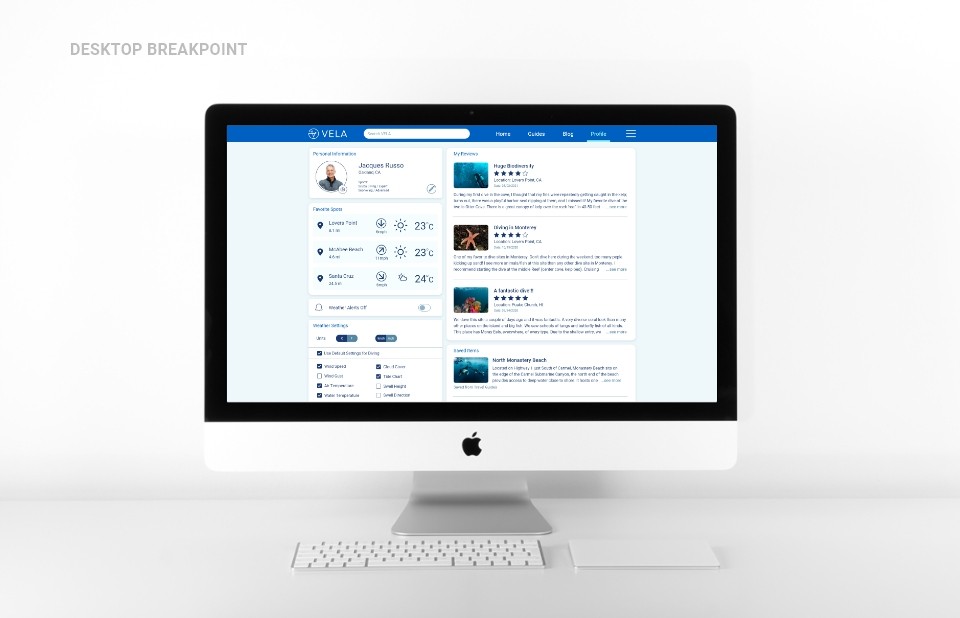
• Displays preferred weather (temperature, winds, storms) and water (temperature, tides, waves, surge, currents, debris, algae) modules;
• Provides weather reports for multiple locations;
• Can save preferences for multiple water sports;
• Provides a guide to interpreting marine weather specific to each location and water sport and lets users add to the information.
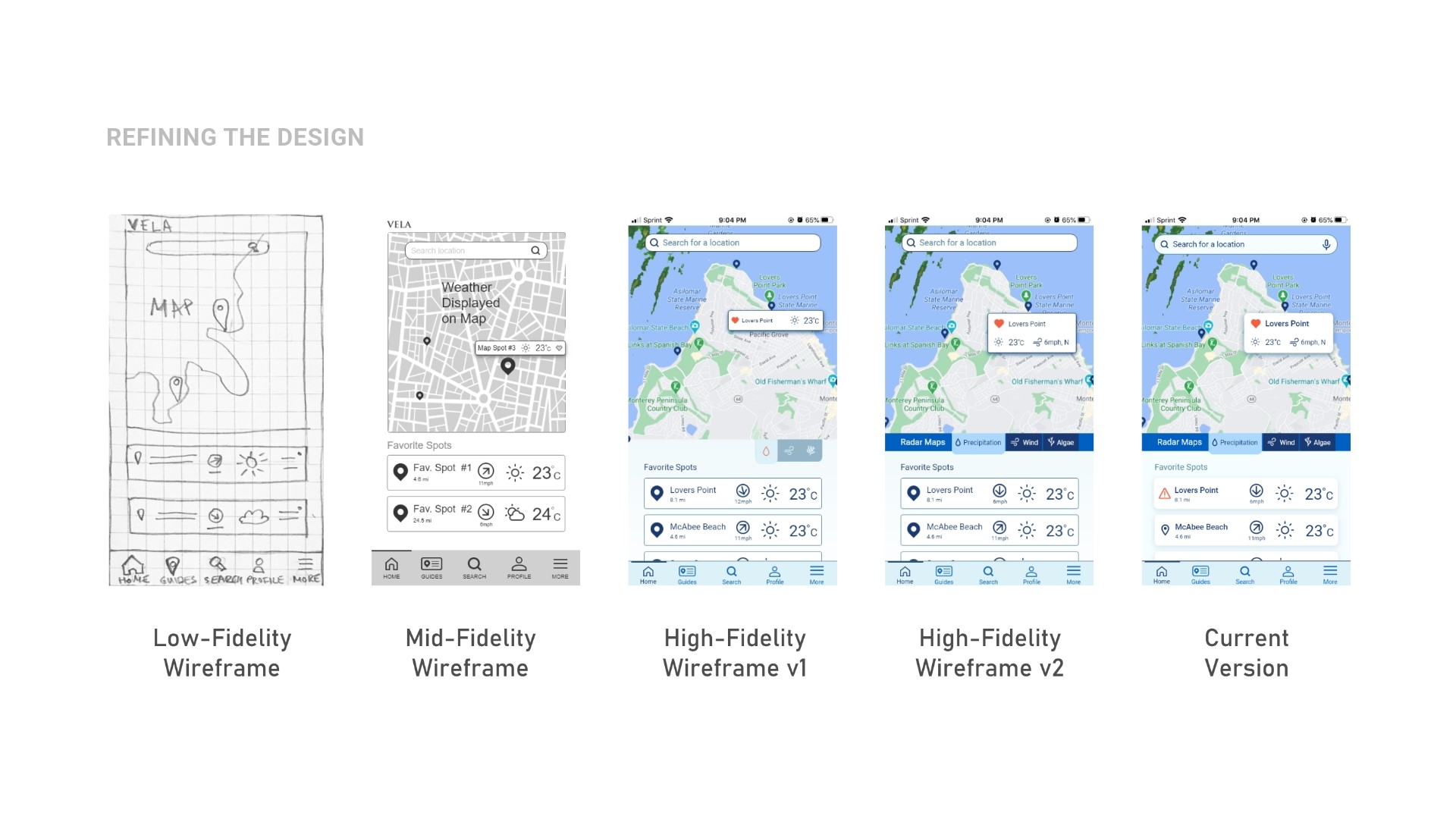
The same user might want some weather data if they are diving and might need slightly different if they will be surfing. Users can save the settings under a separate sport profile along with their preferred locations for that sport. The app can include a map that shows nearby locations along with brief weather conditions.
Emerging opportunities
SWOT and UX Analysis revealed the following product market fit opportunities:
• No existing weather service site/app catering to underwater sports;
• Present detailed data in an easy-to-navigate, meaningful way;
• Reliable service and accurate data across different platforms is needed;
• Visually driven interface with the ability to select spots on a map without typing.
What are Our Business Objectives?
• Differentiate by providing service to an unrepresented segment of water sports, such as underwater activities;
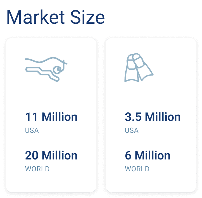
• Potential market: around 3.5 million scuba divers & 11 million snorkelers in the US, 6 million divers & 20 million snorkelers worldwide;
• Gain market share by providing excellent data presentation and accuracy;
• Provide added value by including hard-to-find related information.
User Research Insights
To test the initial hypothesis, I interviewed 5 divers with different experience levels, conducted an online survey, and had conversations on a diving forum.
App Usability
• Convey information at-a-glance; • Weather precision and reliability; • Rating of the conditions for diving.
Safety
Diving Spots
Booking a Diving Trip
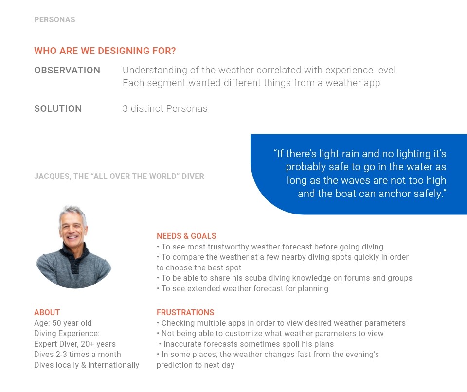
Who are we designing for?
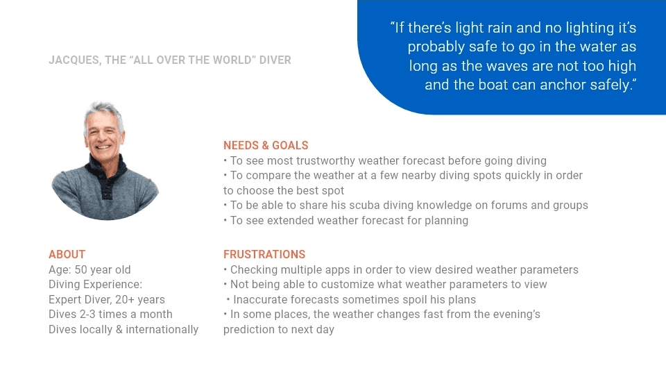
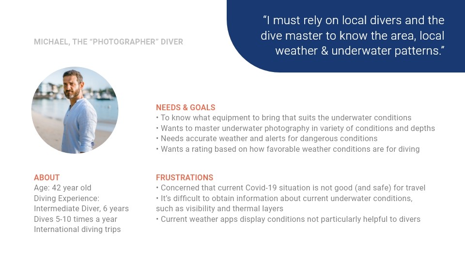
Observation: People’s understanding of the weather correlated with their diving experience level;
Each segment wanted slightly different things from a weather app.
Solution: 3 distinct Personas

What would they need from the web app?
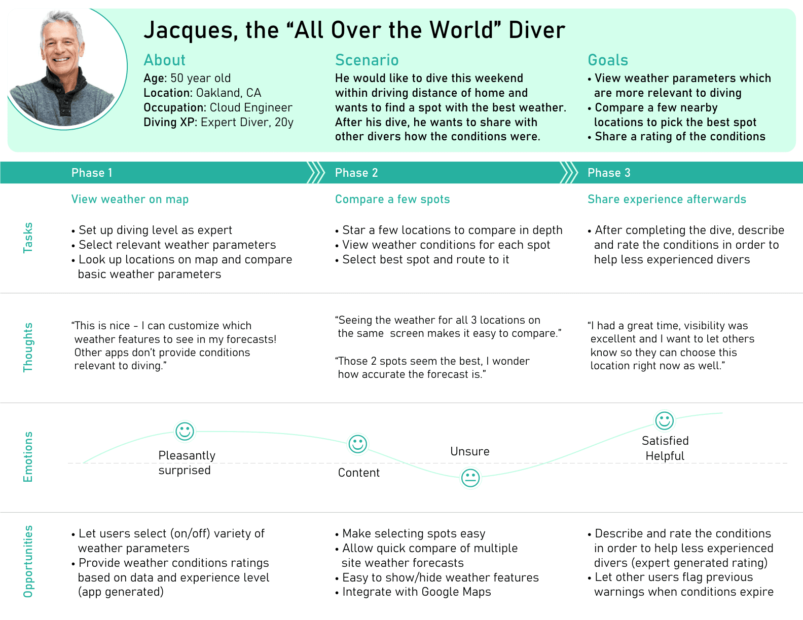
I created User Journeys based on the stories from the interviews, which enabled me to:
• Keep the user’s perspective in mind;
• Zoom in on their problems and start designing solutions by examining how each would go through a likely scenario;
• Track their thoughts and emotions as they went through completing the tasks;
• Identify opportunities for the web app, such as providing safety tips and travel guides.

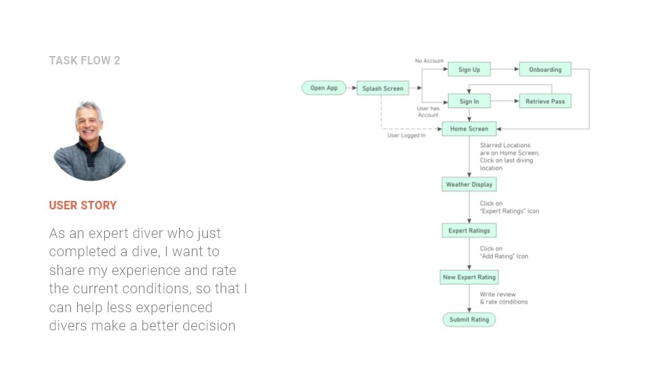
How can they achieve it?

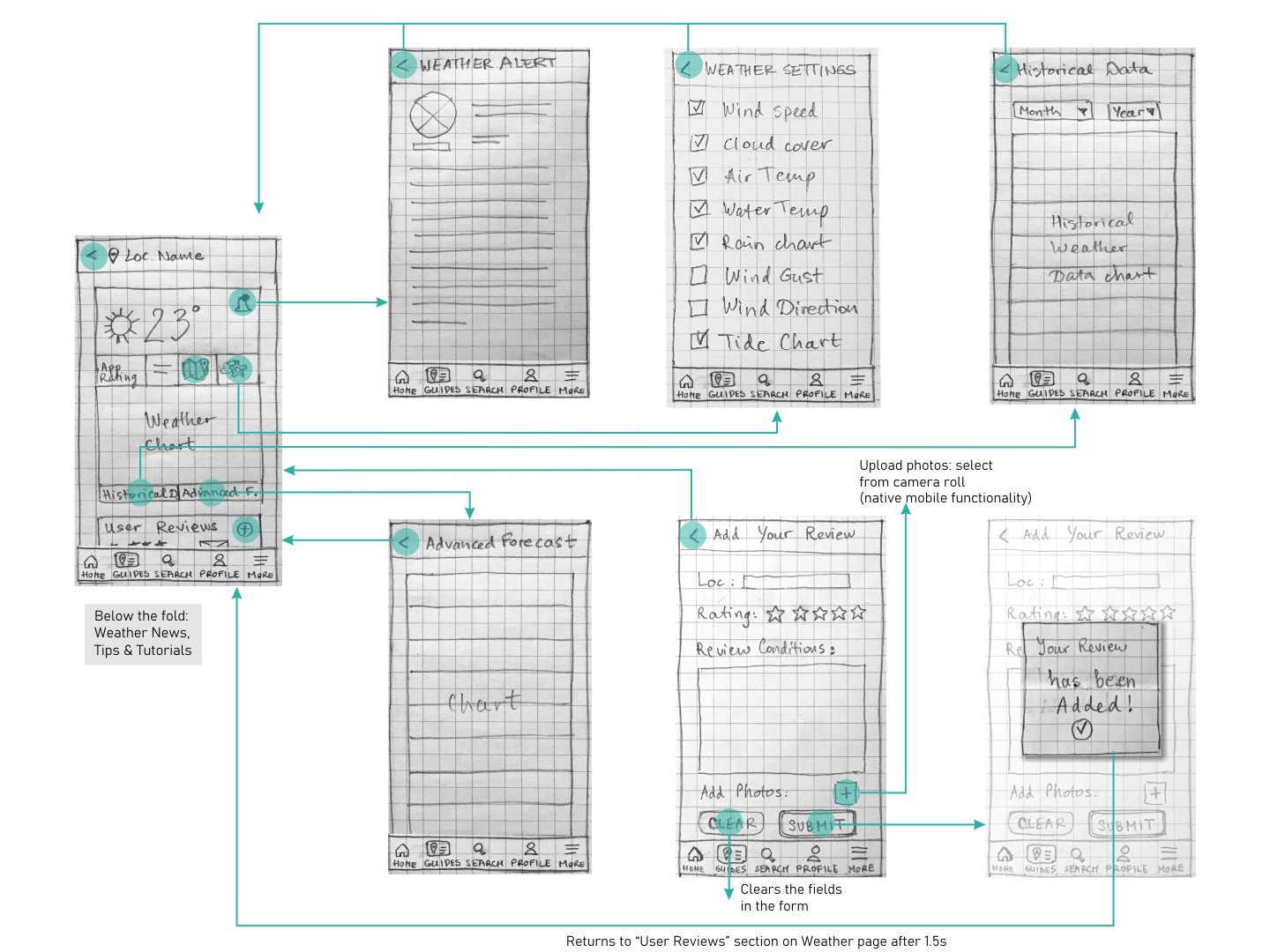
Finally, time for sketching!
Talking to Prospective Users
Summary of findings from 6 usability test sessions:
The algae, weather settings, route, and alert icons were unclear to participants. (high severity)
The rating was ambiguous - how many stars was the maximum? (high severity)
No way to change the degree units from C to F. (medium severity)
Participants wanted to see detailed weather before adding a spot to their favorites. It was not very clear that a spot was added to favorites. The spot card disappeared after clicking on the heart. (medium severity)
The placement of the icons in the top card did not match the participant’s mental model, they went to “More” on the tab menu to change settings and route to the location or to “Guides” to route to the location. (medium severity)
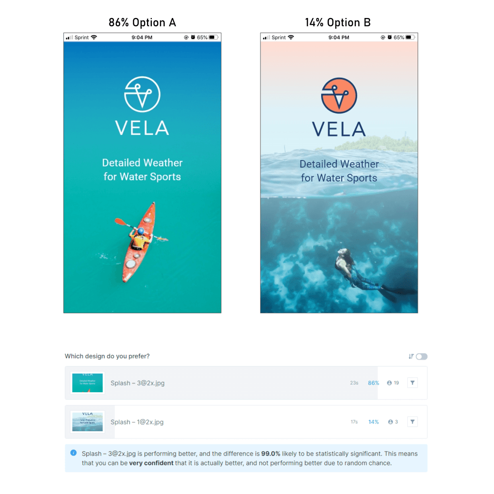
Let’s push it even more - preference testing
People liked the image, colors, and the better contrast between the background and the logo/text color. Frequently used words: cleaner, modern feel.
People liked the less crowded layout, less text, and the radial design caught their eye and felt more dynamic.
